Case Study:
suga•küchen
Introduction:
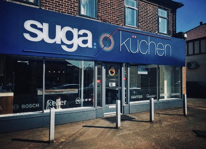
In autumn 2022, Keller Kitchen Centre, a renowned kitchen and appliance seller in Altrincham, underwent a company-wide rebrand; to represent the growing trend and demand of timeless Bauhaus design, as well as representing growth within a new chapter of the business. They wanted a more modern approach and a fresh new look to their company. To achieve this, they enlisted the help form our team at PCE Social. We were tasked with creating entirely new Brand Guidelines and collateral; business stationery, literature, fleet liveries. The new name, suga•küchen, was a playful take on the name of director Danil Sugakov, as well as reflecting the company’s love for German kitchens and contemporary design.
Background:
Keller Kitchen Centre has been operating for over 36 years, providing high-quality luxury kitchens and appliances to the people of Altrincham and surrounding areas. Their commitment to quality, design, innovation, and customer care has made them a trusted name within the industry. The transformation into suga•küchen allowed the team to invigorate their company and create a sustainable, contemporary brand that reflects their vision for the next 36 years.
Design Process:
We conducted a deep dive to understand their clients, their target audience and their preferences – beginning by researching current and timeless trends in kitchen design and branding. We then developed a brand strategy that would help suga•küchen stand out in the crowded market.
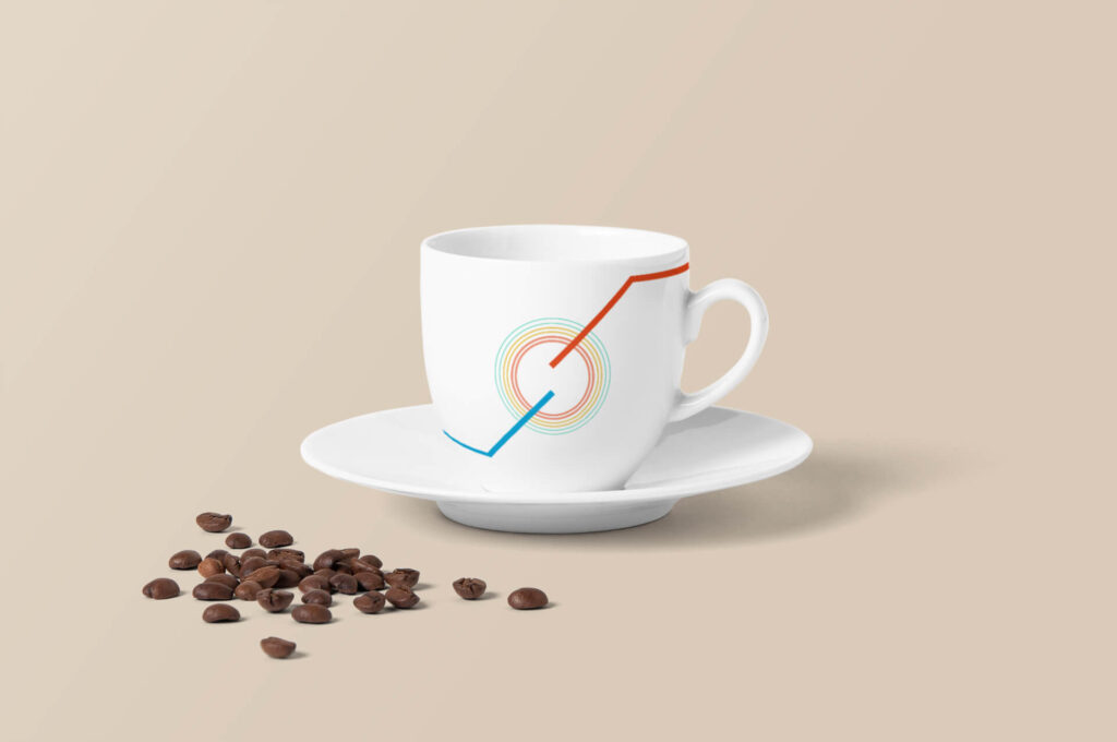
The new branding uses Vermillion red and Electric blue as its primary colours, to represent the fundamentals of the company and cooking; heat, engineering, energy and passion meets cool, fluidity, water and wiring – as well as a sweet take on ‘suga’ lumps, stacked next to the name (i.e “one lump or two?”!). The size and spacing of these are directly carried over from the umlaut within kuchen – which doubles up as a smiling face to highlight their excellent customer service. The secondary colours encapsulated in the ‘hob’ centrepiece (which also doubles up as an ‘S’ emblem) contain Eucalyptus and Maize, representing sustainability and friendly customer service. The branding is heavily influenced by the Bauhaus movement; a conscious decision to continue the ethos of fusing art with functionality, via simplistic yet forward thinking design. On top of this, inclusion and open mindedness, play an integral part in suga•küchen’s operations.
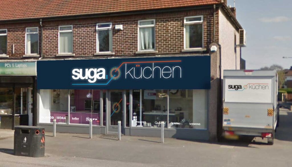
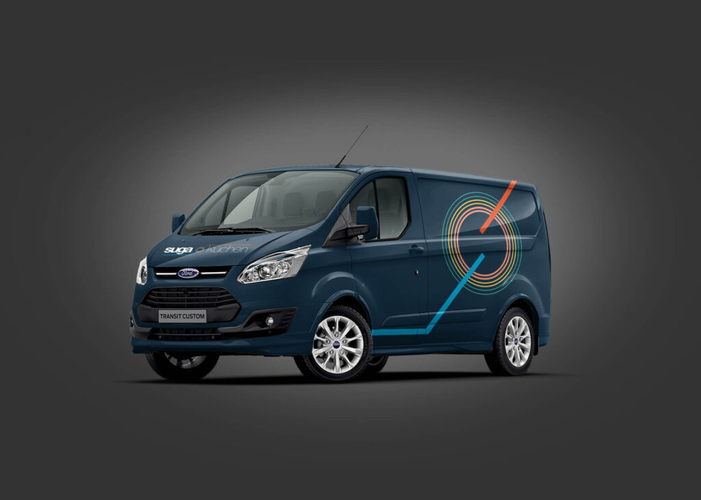
From a practical point of view, we mocked up an illuminated shop fascia ahead of its production, as well as positioning the window displays of the main brand logos at a height that matched the busy road outside; often prone to standstill traffic. The company fleet was adorned in Pantone-matched vinyl graphics – made easier from the comprehensive brand guidelines featuring inverse branding options for a variety of background colours.
Overall our approach to the rebranding project helped suga•küchen create a new brand identity that is bold and memorable, yet sharp and not too overpowering – all the while reflecting the client’s focus on high-quality, modern design.
The official rebrand launch took place on 22nd March, 2023.
Latest News & Case Studies
InHome Media
Case Study: inHome Media Social Media Management & Ad Campaigns InHome Media have been with PCE Social since 2019 who were look to save time outsourcing their social media content creation. InHome Media are a family run home entertaining installation company who were already locally established with a fanatic present in their field of expertise. […]

Johnson Geddes
Case Study: Johnson Geddes Website & Ad Campaigns Johnson Geddes have been with PCE Social since 2018; our sister company had already provided IT Support and maintenance at the time they approached us for Marketing. Johnson Geddes have been helping people with financial problems since 2012 as licensed Insolvency practitioners. We were approached by Paul […]
The Starving Man
Case Study: The Starving Man Website, App, Design & Digital POS The Starving Man have been with PCE Social since 2016 who originally asked us for advice on becoming more socially aware and increasing sales for their takeaway. They are a family run takeaway based in Altrincham, who at the time, didn’t have a website […]